These are just some of the things I am thankful for! :)
Wednesday, November 24, 2010
Thursday, November 18, 2010
Photoshop Cheats Week
This is a picture I found on the web of the Cyclone, a rollercoaster at Coney Island, that I added the "cheat" Dream Blur off of the internet. I really liked the way it boosted the color, and overall just thing it brightened a kind of boring picture.
This picture I used an ifra red tool I believe. It made the bushes look kind of purple and made the car look older and more decrepit.
This car I added a dream blur effect to. I think it added something to the picture but I'm not sure what, it kind of gave it some more character I think.
This picture I used an ifra red tool I believe. It made the bushes look kind of purple and made the car look older and more decrepit.
This car I added a dream blur effect to. I think it added something to the picture but I'm not sure what, it kind of gave it some more character I think.
Monday, November 8, 2010
Tilt Shift!
This is a picture of Yankee Stadium that I added the tilt shift affect to. I upped the contrast to it and I really like how it made the fans look darker blue, I think it adds a lot to the picture. I also saturated the field to make it look bright green. I really like how this picture turned out.
I applied most of the same techniques that I used in the last picture. However, with this picture I found that I liked the way it looked in Photoshop a lot better than how it looks on the blog.
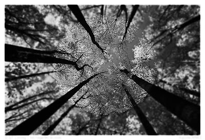
These are both pictures I found that were taken looking up into the trees. I like the green trees picture a lot better for the fact that the snowy trees picture looks really fake in a bad way.
These are two pictures I also used the tilt shift feature on. I really like how the picture of the golf flag turned out but I don't like the golf ball picture as much, I think it just looks like I blurred the background.
I found this picture on the internet and I liked the look of it so I applied the tilt shift effect to make the background look blurred and made it look like I applied the flag myself.
Friday, November 5, 2010
Through using the color replacement tools I took the orange color of another cat and made my gray cat orange! I really think the color looks fake and have definitely come to the conclusion that my cat looks better gray and black! :)
These are the same pictures in both these masks, I just used two different fonts. I like the top font a lot better because I think that the pine font adds a lot to the picture due to the woodsy appeal. However, I like that you can see more of the picture in the last text.
Subscribe to:
Posts (Atom)


