Thursday, November 18, 2010

Photoshop Cheats Week

This is a picture I found on the web of the Cyclone, a rollercoaster at Coney Island, that I added the "cheat" Dream Blur off of the internet. I really liked the way it boosted the color, and overall just thing it brightened a kind of boring picture.

 This picture I used an ifra red tool I believe. It made the bushes look kind of purple and made the car look older and more decrepit.
 This car I added a dream blur effect to. I think it added something to the picture but I'm not sure what, it kind of gave it some more character I think.

Monday, November 8, 2010

Tilt Shift!

This is a picture of Yankee Stadium that I added the tilt shift affect to. I upped the contrast to it and I really like how it made the fans look darker blue, I think it adds a lot to the picture. I also saturated the field to make it look bright green. I really like how this picture turned out.

 I applied most of the same techniques that I used in the last picture. However, with this picture I found that I liked the way it looked in Photoshop a lot better than how it looks on the blog.


 These are both pictures I found that were taken looking up into the trees. I like the green trees picture a lot better for the fact that the snowy trees picture looks really fake in a bad way.


 These are two pictures I also used the tilt shift feature on. I really like how the picture of the golf flag turned out but I don't like the golf ball picture as much, I think it just looks like I blurred the background.

 I found this picture on the internet and I liked the look of it so I applied the tilt shift effect to make the background look blurred and made it look like I applied the flag myself.

Friday, November 5, 2010


Through using the color replacement tools I took the orange color of another cat and made my gray cat orange! I really think the color looks fake and have definitely come to the conclusion that my cat looks better gray and black! :)


These are the same pictures in both these masks, I just used two different fonts. I like the top font a lot better because I think that the pine font adds a lot to the picture due to the woodsy appeal. However, I like that you can see more of the picture in the last text.

Wednesday, October 27, 2010

Happy Halloween!

Pete's Saw Shop - This is an old business in O'Neill that I took a picture of when it was raining, so the raindrops add to the effect.

This is another picture that I took of the O'Neill Cemetery,  I added some ghosts using the brush tool along with the moon and clouds above. And in the foreground I added text.


Wednesday, October 20, 2010

Week 9 - October 18 - 22 - Brush Tools

This picture is one I made using different snowflake brushes that I found on the Internet. I used many different styles and colors and than added the picture we used on our Christmas card last year and added some text. 

This picture was made using the gradient tool for the background and a husker stamp that I made from a picture I found on the Internet. The picture of the Husker game itself, I took last year at the first game of the 2009 season.
 This was a real simple picture that I just used different flower brushes and some free-form text.

Tuesday, October 5, 2010


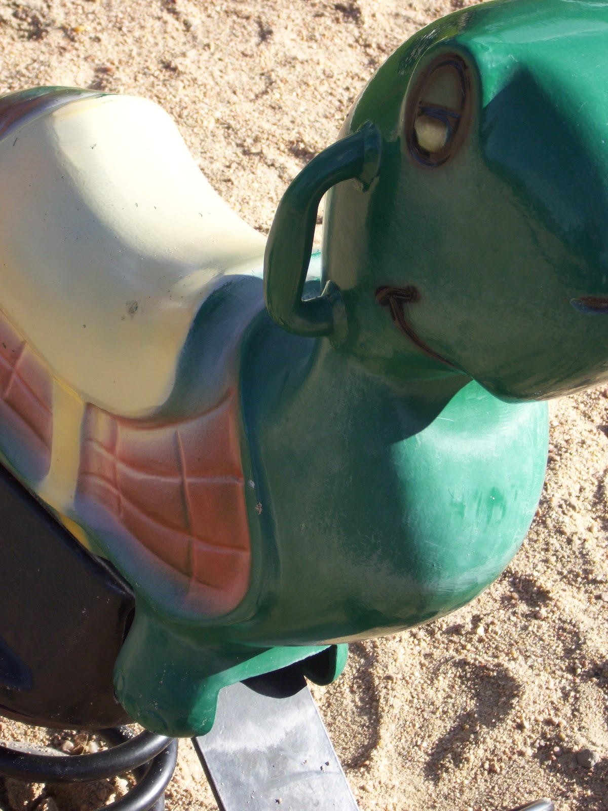
These are pictures that I have taken. On the first one, I was at the first Nebraska Cornhusker game of the season last year when I took it. I made the picture black and white and then colored back in the N and the word Huskers in the end zone. I like the effect that this adds to the picture. (GO BIG RED! :] ) The second picture I used on last weeks blog but this week I added some text with some help of the use of paths. I like how the words look even if they are a little bunched up because I makes me think of them as looking more like water droplets coming out of the spout. They begin in sort of a puddle and lengthen back out until they hit the cement drain at the bottom. So I liked what I did with that picture a lot. The third picture is one I took at the Kiddie Park with my camera in the sand, I found the quote on the internet. I don't know for sure if I like may path placement a lot, but I think it turned out fairly well. Finally my last picture was also taken at the Kiddie Park. I selected just the slide and used the black and white feature on it but changed the tint to red since the slide has a lot of red in it. I think this picture also turned out kind of cool.


Friday, October 1, 2010

Week 6 - Photography September 27 - October 1

 For this weeks projects, our focus was photography. These are pictures that I took around the school.

I used the burn tool on three of these pictures just to darken a few spots. I really like the angles that I got on these shots. I feel like I did a nice job finding some different things to take pictures of to. So overall I think that this week I did a pretty decent job.